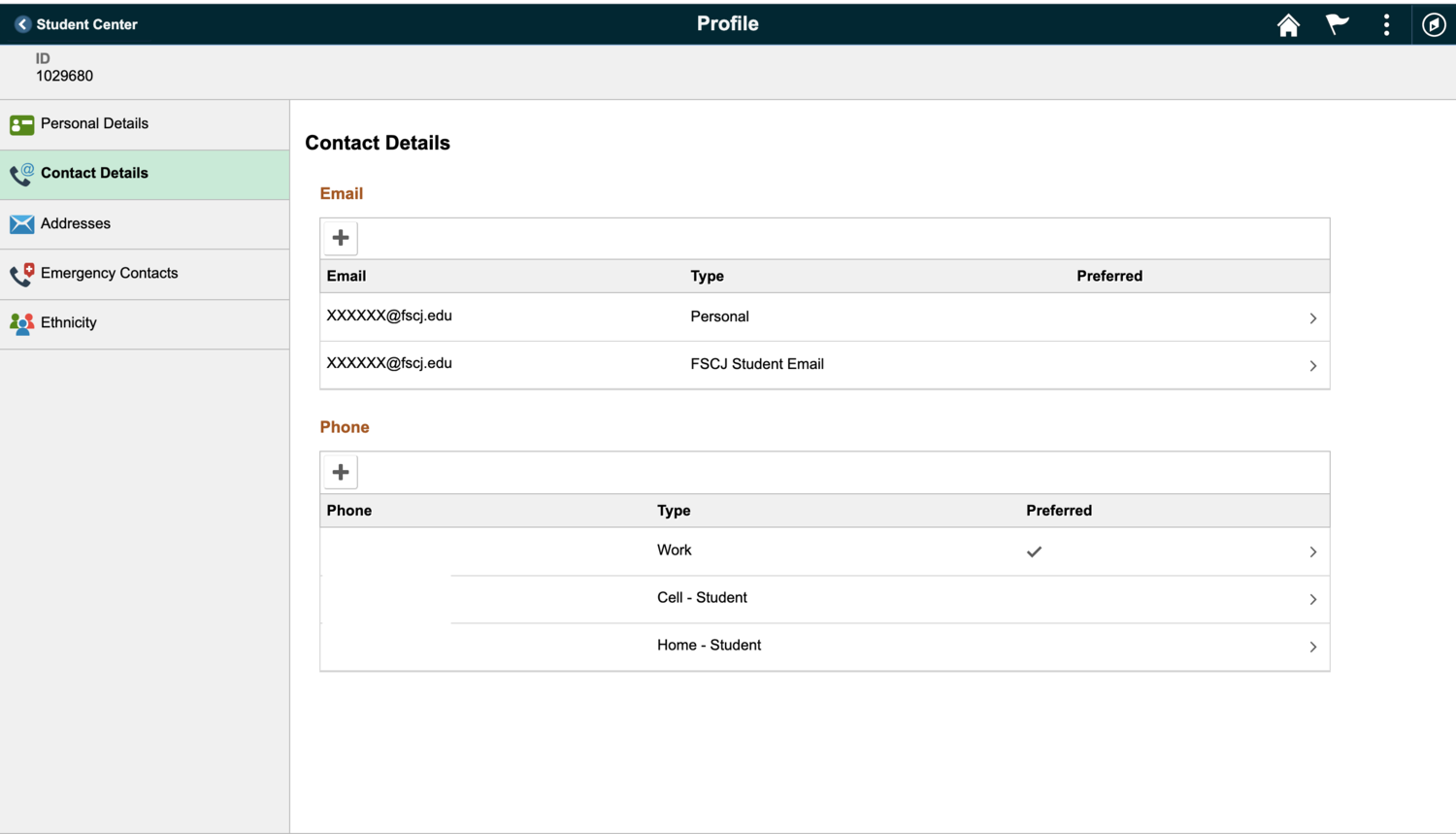
The myFSCJ FLUID Interface - myFSCJ Screens Preview
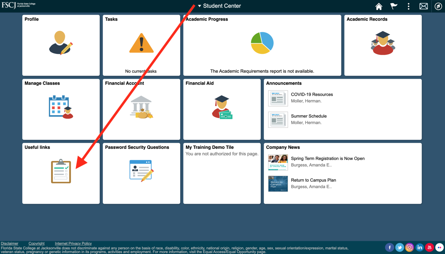
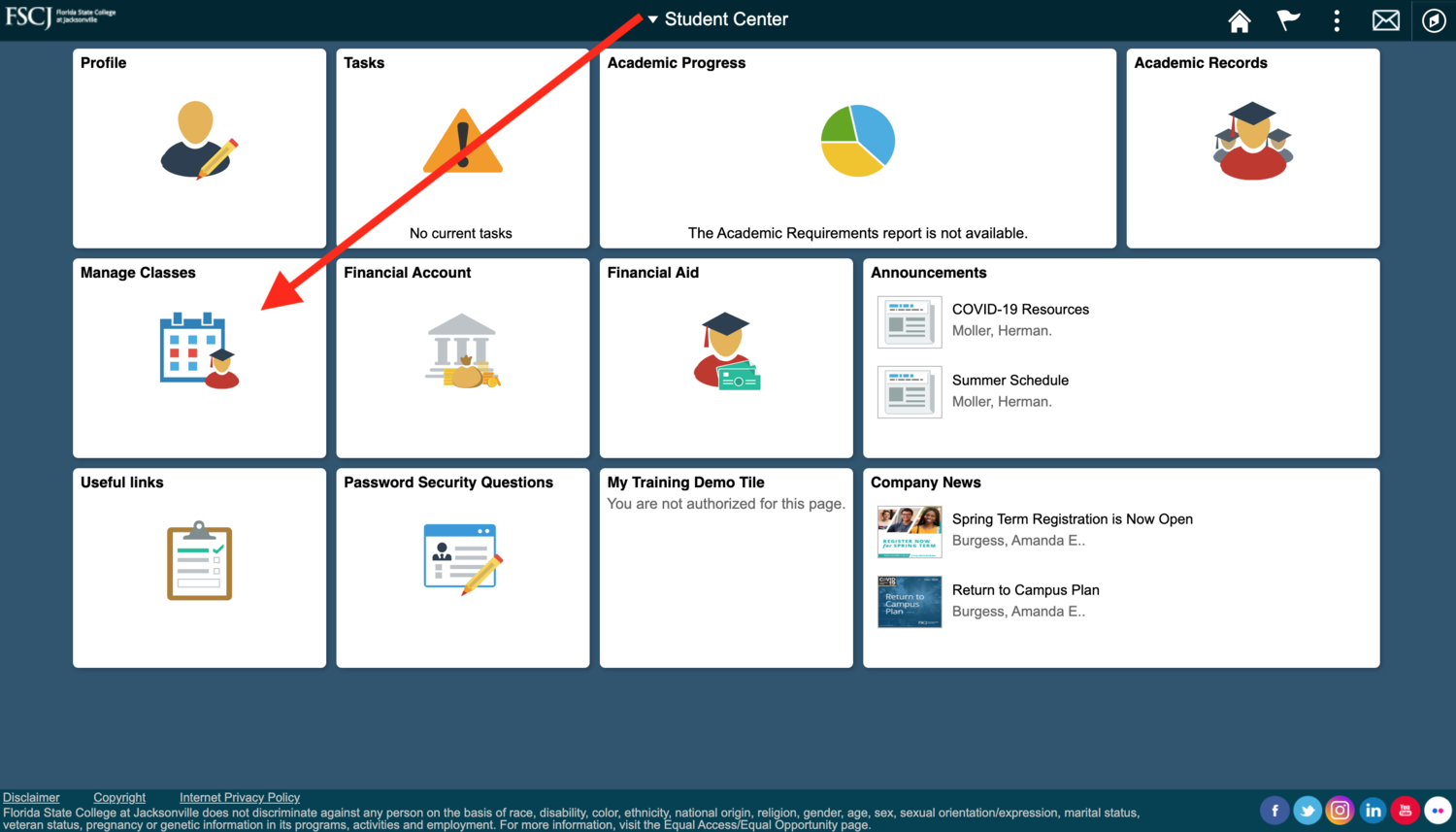
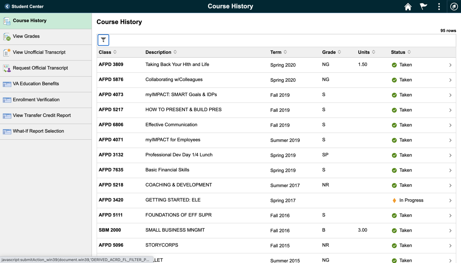
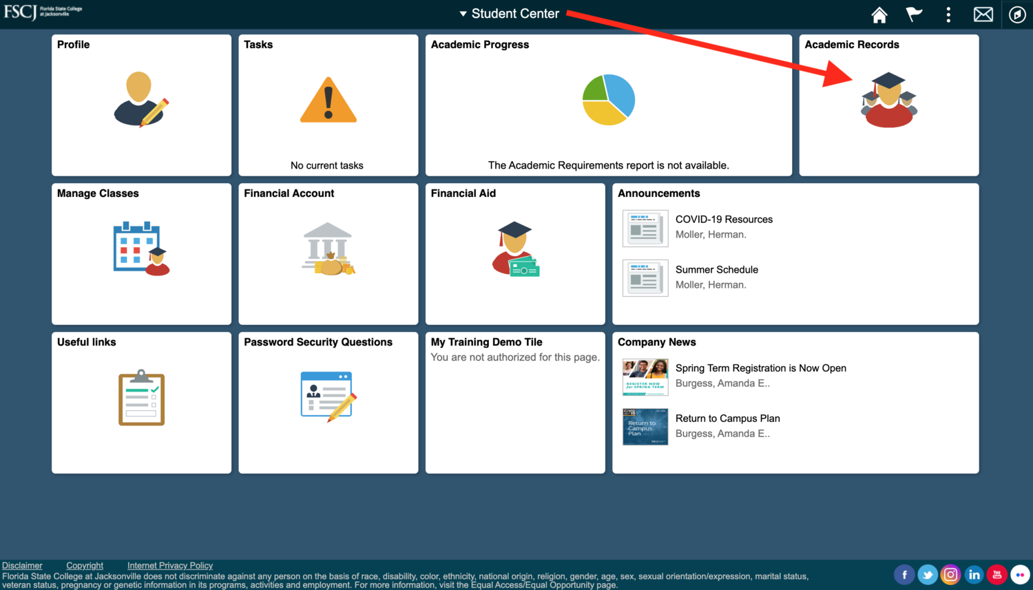
On May 10th, the myFSCJ portal will look different for faculty, staff, and students. As the project goes live, users will see an updated interface intended to optimize the user experience and reduce clicks for common workflows. Although the visual change will be drastic, this project focuses on the appearance of the screens, with little to no change in functionality. For example, users will start from a Faculty, Employee, Student, or Manager home page instead of using the role-based tabs that we are used to. Then, to initiate a process commonly performed within that tab, users will now use tiles.
*The screen previews below are intended to provide an overall view of the visual changes - the details may look slightly different once live.
The Student Center Home Page
