Canvas New Feature Release, October 16, 2021
Instructure will perform its monthly release of new features to Canvas on Saturday, October 16, 2021. This is a part of the regular process by which Canvas provides new features to all of its users on the third Saturday of every month, without interrupting access to the system. More information about how Canvas releases work can be found here. This month, a series of small changes to the Canvas interface should result in big improvements in the efficiency of a few key Canvas processes.
Accessibility Checker Badge
If you are not already familiar with the Accessibility Checker that is a part of the Rich Content Editor, October is a great time to get to know it! The next time that you attempt to edit one of your Canvas content items, below the text editor you may notice a small red number badge at the top right of a little icon that bears a strong resemblance to Leonardo da Vinci’s Vitruvian Man, as shown in the image to the right (the icon is highlighted in green). This icon is the Accessibility Checker, and the number lets you know how many portions of your page’s content might present issues for students with visual or auditory impairments. Clicking on the icon will open up a fly-out tray on the right that details each of the accessibility issues on your page and provides actionable suggestions for resolving it.
The image below provides an example of what this might look like. In this example, the blue highlighted text is colored in a way that would make it difficult for some students to read. Changing the text color to the suggested one in the fly-out menu would resolve this issue. If the chosen color is not what the professor would like, then the dot below will allow the instructor to change to a different color. If the new choice is not accessible, then the “apply” button at the bottom right of the fly-out menu will not be activated. Once the change is applied, then the accessibility checker will move on to the next issue.
“Sticky” Course Navigation Menu
The next portion of October’s updates is a simple change to the course interface. Now, as users scroll down the page to view course content, the course navigation menu will “stick” so that it remains visible, even on a particularly long content item. This small but useful change is illustrated in the image below. Note that Canvas Admins will see a similar change enacted on the admin navigation menu.
Course-Level Notifications Editable in User Profile
While instructors and students have had the ability to set different notification schemes in all of their courses for several months, previously a user had to navigate to each of their individual courses in order to set customized notifications for it. Now, the entire notifications workflow has been simplified so that all customizations can be done from the notifications menu within the Account section of the user profile. Beginning this month, a drop-down menu at the top of the notification settings page will provide the opportunity to toggle between classes to make small changes to each course’s notification settings, as shown in the image below. Note that the “Account” settings provide the global options and, if individual courses are not customized, they will default to this set of notifications.
Changes to the Canvas Gradebook
The next two updates to Canvas affect the faculty experience within the Gradebook and have no impact on what students see. They should, however, make a few details of the grading process easier.
Ability to Change Assignment Status from the SpeedGrader
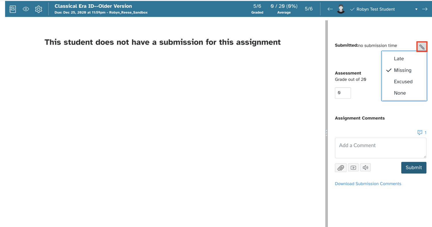
The ability to change assignment status has been added to the grade details area within the SpeedGrader, a small but impactful change. As an example, in the image below, the student has not submitted an assignment that is past due, giving her an automatic submission status of “missing” and auto-administrating a zero. This would probably be noticed by the teacher during the process of grading a batch of papers, and can be addressed immediately if it is not correct. By clicking on the pencil icon, this can be changed to “Excused”, removing the zero from the grade without the instructor needing to re-visit the grade tray within the gradebook.
Search by Assignment and Student in Gradebook
The top of the gradebook will now display search fields to allow faculty to pinpoint specific students and assignments within the gradebook view to make research and data entry easier. The search boxes are very responsive and begin to work after three characters are entered. In the GIF below, the partial word “home” has been entered into the search bar, eliminating all columns except for three with the word “homework” in their title and the assignment groups (grade subcategories) to which these assignments belong.


