FSCJ’s 2023 Canvas Usage Wrapped
You may be familiar Spotify’s Yearly Wrapped, a fun overview of a person’s listening habits over the year. Today, we want to share our version of a Canvas Wrapped - a look at FSCJ’s Canvas usage from the past year and beyond. Below are a few graphs that visualize all the ways that we use Canvas at FSCJ. Let’s take a closer look at the data. Like Spotify’s Yearly Wrapped, you may be surprised what the data reveals!
Canvas Contents and Activities
First, let’s take a look at the Contents and Activities data. This data spans from September 2021 to September 2023.
The blue bars indicate active courses. For a course to be considered active, it must meet the following criteria:
Must have a start and end date.
Must have a teacher enrolled.
Must have at least 3 students enrolled.
All students must have activity time (accessing a page, submitting an assignment, etc.)
This criteria ensures that course shells like your faculty sandbox are not included in the data. As you can see, we have a lot of classes that meet the criteria! Understandably, we have fewer classes in the summer.
The dark blue horizontal line indicates the average monthly percentage of activities by students. Activities include submitting quizzes, discussions, and assignments. As you can see, FSCJ is consistently over 80% in activity usage and often above 85% usage.
The red horizontal line indicates the average monthly percentage of content accessed by students. Content includes pages, modules, and files. We see that students are accessing content quite often, frequently around 90% usage.
What does this mean?
This data indicates that FSCJ has consistent and high usage of Canvas’ features. Even our Canvas representative was impressed, noting that these numbers are higher than most other colleges she’s seen.
A Closer Look at Student Activities
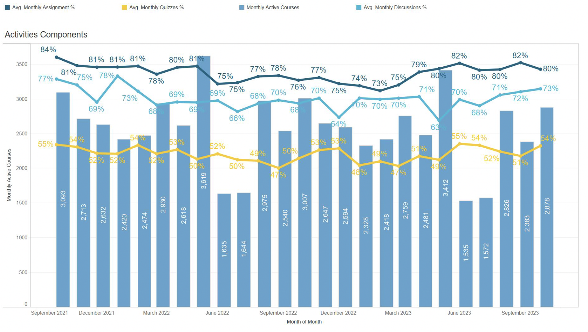
Let’s take a closer look at how students are utilizing Canvas. The following is a graph drilling down the specific activities. Remember that activities include assignments, quizzes, and discussions.
Again, the blue bars indicate active courses. These numbers are the same as the other graph since we are looking at the same classes.
The dark blue horizontal line indicates monthly percentage in Assignments. Students are consistently submitting more assignments than any other activity, falling within 75% - 84% of the usage.
The light blue horizontal line indicates average monthly percentage in Discussions. Though not as popular as assignments, students are using discussions frequently with around 70% usage.
The yellow horizontal line indicates monthly percentage in Quizzes. Students are using Quizzes the least often of the three activities. Even so, we are around 50% utilization of Quizzes in Canvas.
What does this mean?
We saw in the first graph that FSCJ has a lot of activity in our Canvas courses. Of these activities, Assignments are utilized the most. Since Quizzes are utilized the least, we have an opportunity to dig deeper into why that might be. Perhaps faculty prefer to conduct exams in person; perhaps faculty find the Quizzes tool too difficult to use; perhaps the Quizzes tool is fine, but faculty prefer other kinds of assessment. There are many possibilities, and this data allows up to ask the right questions so that we can make the most out of Canvas.
Thank you!
Our students would not be using Canvas so effectively if it were not for our knowledgable faculty and staff. Many thanks for a fantastic job to all the FSCJ community! If you have any questions or have some great ideas about how to better utilize Canvas, please do not hesitate to reach out to us by emailing EdTech@fscj.edu.
If you are experiencing any technical issues with Canvas or other FSCJ-related technology, then you can submit a help ticket at help.fscj.edu.
If you would like additional training on Canvas, then check out some amazing training opportunities through myLearning.


